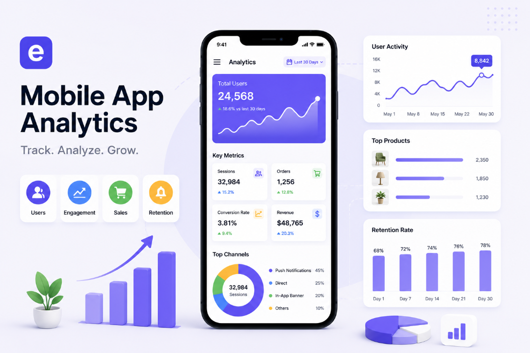
TL;DR: See exactly how your Shopify app is performing. Evlop's 5 built-in dashboards turn your Google Analytics and Firebase data into clear, actionable insights.
Stop guessing and start scaling with real-time clarity across five core focus areas:
Overview— High-level health check: view total sales, live active users, bounce rates, and user activity heatmaps.Revenue— True financial performance: track conversion rates, average order value (AOV), and daily performance trends.Acquisition— Traffic engine: see exactly where installs originate (push, deep links, or direct) and monitor daily engagement metrics.Retention— Loyalty tracker: keep tabs on repeat purchase rates, customer lifetime value (LTV), and new vs. returning session trends.Customer Journey— Conversion funnel: track product views, cart drop-offs, wishlist additions, and best-selling inventory.
Where the guesswork lives
Most Shopify store owners are making mobile decisions with one hand tied behind their back.
Shopify's native dashboard tells you what sold and when. It does not tell you which products a customer spent three minutes browsing before quietly leaving the app. It does not tell you that your iOS users convert at a higher rate than Android users. It does not tell you that your biggest traffic spike of the week happens on Wednesday evenings — not Sunday mornings the way you assumed when you scheduled that campaign.
These gaps are not a minor inconvenience. They are the difference between actively optimizing a mobile channel that could drive 40% of your revenue and guessing at it until something accidentally works.
Without visibility into what customers actually do inside your app, every decision you make about your mobile channel is an educated guess at best.
Your app is generating data. Almost none of it is reaching you.
Every session in your mobile app produces a continuous stream of behavioral signals. A customer installs the app. They open it three times this week but only browse on one of those sessions. They view a product, save it to their wishlist, return the next day, add it to cart, and then — for reasons you currently cannot see — they leave without checking out. The session ends. The signal is lost.
Most mobile app platforms either don't capture this data at all, surface it in a way that requires a developer to interpret, or give you a handful of top-level numbers (installs, sessions, revenue) without showing you the connections between them. You know the inputs and you know the outputs. The journey in between — the part where your customers decide to buy or keep browsing or close the app entirely — is a black box.
Google Analytics and Firebase already capture this data, and they're exactly where Evlop's Analytics pulls from, but they were built for developers to query, not for a merchant to glance at and understand. That gap is where the real black box lives.
Analytics: five views into what's actually happening
Evlop connects your mobile app to Firebase and Google Analytics to capture behavior at every stage of the customer journey, then organizes it into five purpose-built tabs: Overview, Revenue, Acquisition, Retention, and Customer Journey. A date range selector at the top of every page lets you pull any window of data — last 7 days, last 30, a custom period around a campaign launch — so every view is as specific or as broad as the question you're trying to answer.
1. Overview
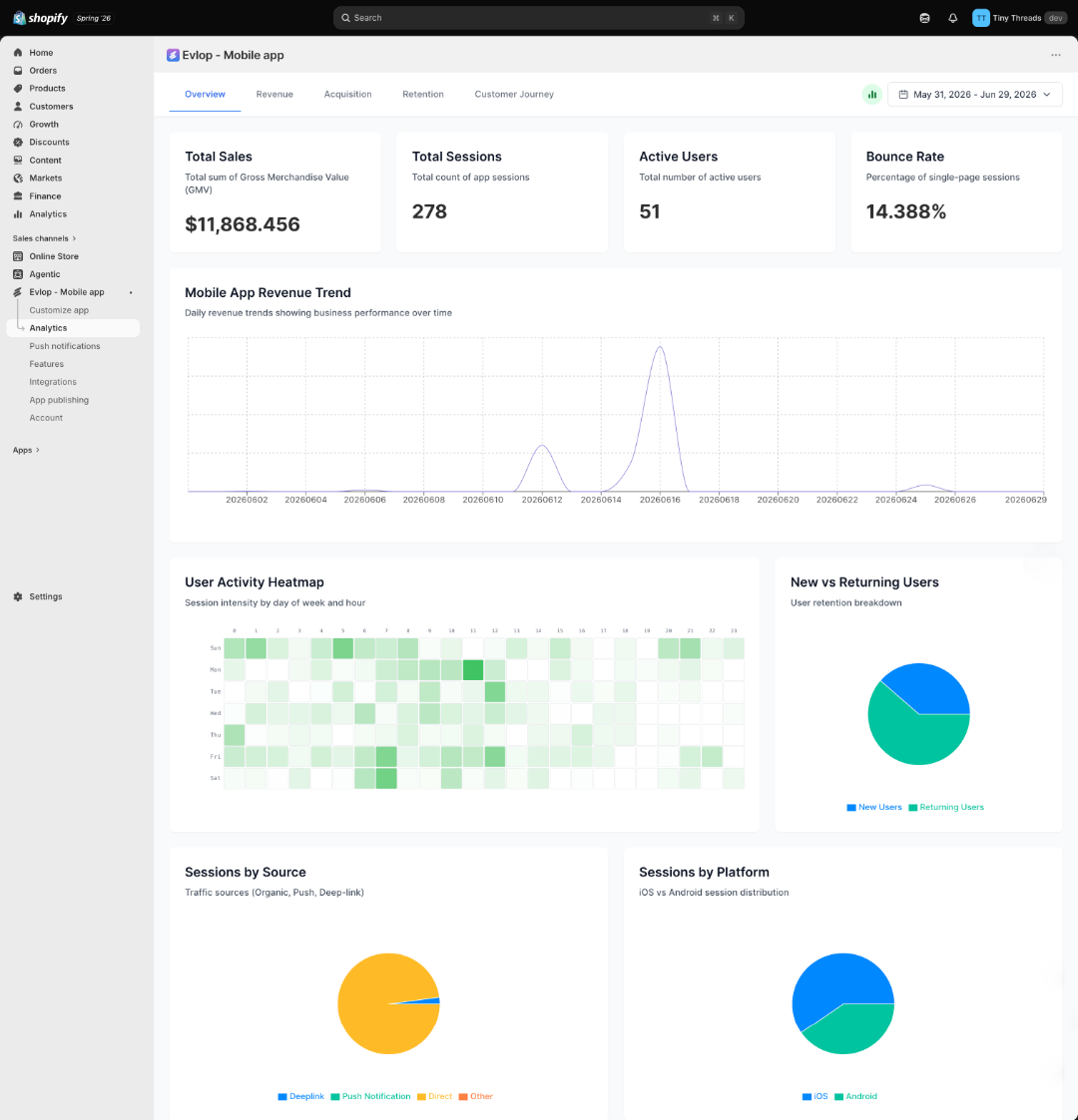
This is where you start every session. Before you go anywhere else, this page tells you whether things are moving in the right direction.
Four key metrics sit at the top: Total Sales and Sessions measure growth, while Active Users and Bounce Rate tell you whether the people arriving are actually sticking around.
The Revenue Trend graph sits below them, visualizing your sales patterns over time — the peaks, the dips, and the specific days where a campaign or a product drop actually moved the needle.
The User Activity Heatmap shows which hours and days of the week your customers are most active inside the app. That is not a decorative chart. It is the data point that determines when your push notifications should fire.
The New vs Returning Users chart shows the shape of your audience growth — how many customers are discovering the app for the first time versus how many are choosing to come back.
Sessions by Source closes the overview, breaking down which channels are driving your traffic: push notifications, deep links, or direct opens. This is where you find out which of your marketing efforts is actually working.
2. Revenue
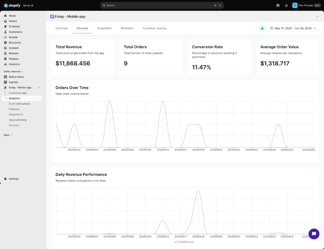
It goes one layer deeper into the financial side.
Four metrics anchor the top of the page: Total Revenue and Total Orders sit alongside Conversion Rate and Average Order Value. Together they tell you not just how much your app is earning, but how efficiently it is turning visitors into buyers.
The Orders Over Time graph tracks daily order volume, making it easy to spot consistency or identify the specific days where sales surged.
The Daily Revenue Performance graph shows earnings day by day. This is the view that settles the question most merchants ask after running a campaign: did the push actually move the number, or did that revenue arrive on its own?
3. Acquisition
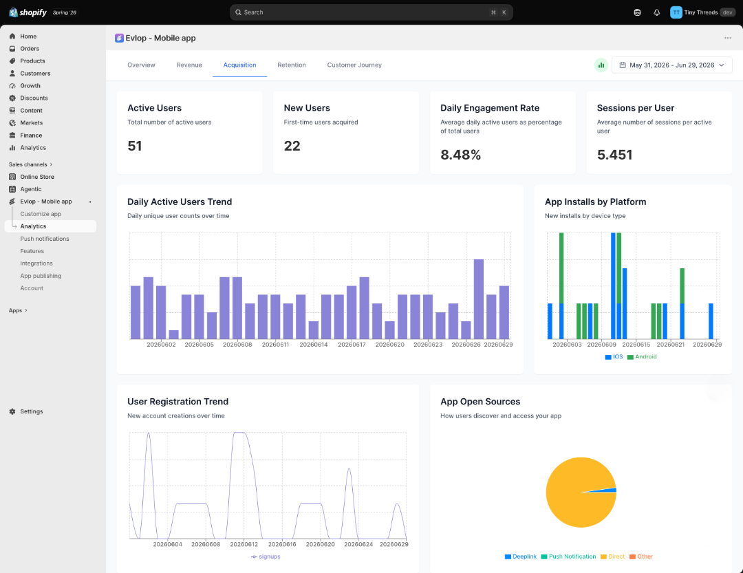
It answers the question most merchants ask second but should ask first: how are people finding the app, and are the right people showing up?
Active Users and New Users acquired over your selected period give you the headline numbers. Daily Engagement Rate and average Sessions per User tell you whether those installs are translating into real interaction — or just inflating a number that doesn't convert.
The Daily Active Users Trend shows unique user counts by day, and it almost never matches the days you assumed were your strongest.
App Installs by Platform breaks new installs between iOS and Android. That platform split is an early signal of who's engaging with your app, and it's a foundation you can build on as more session data accumulates.
User Registration Trend tracks how many visitors are converting into actual registered users.
The App Open Sources chart closes this tab. It shows how users are actually entering the app — through a push notification click, a deep link, or a direct open — so you can see which of your channels is doing the real work of bringing people back.
4. Retention
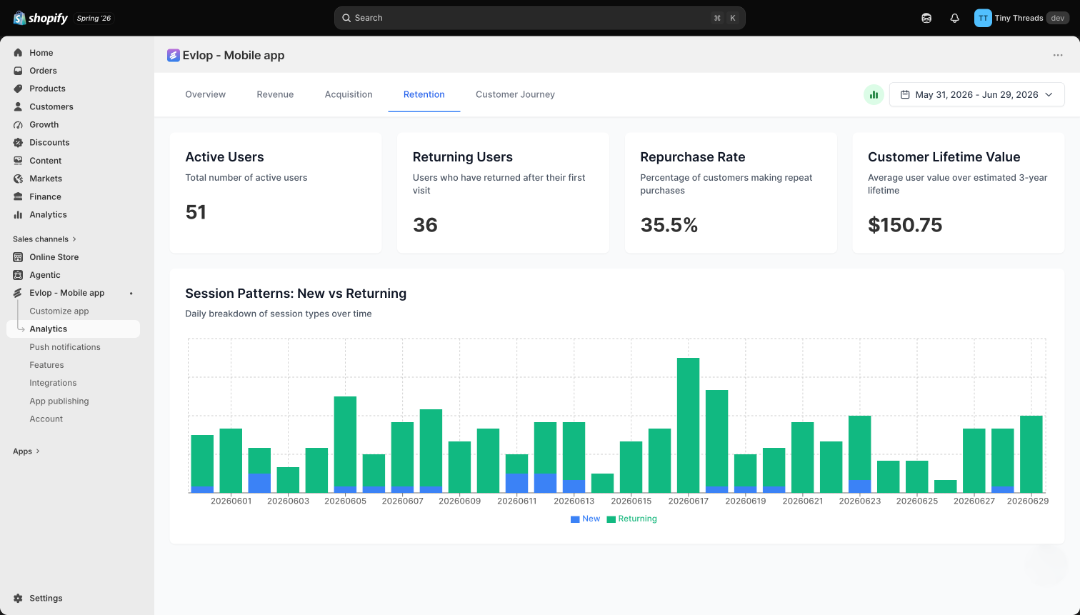
This is where long-term business health becomes visible.
Active Users and Returning Users sit side by side at the top. The gap between them is one of the most instructive numbers in the dashboard — it is the share of your audience that chose to come back after their first visit.
Repurchase Rate and Customer Lifetime Value add the revenue dimension. A customer who returns twice and buys on both visits is worth a fundamentally different amount to your business than one who installs, browses once, and never comes back. These two numbers make that difference explicit. Together, they're your clearest read on real customer engagement — not just who installed the app, but who's actually still choosing it.
The Session Patterns chart breaks down daily traffic into new versus returning sessions. Watched over time, it tells you whether your returning audience is growing relative to first-time visitors — which is the clearest signal of whether your app is building a loyal customer base or just processing one-time transactions.
5. Customer Journey
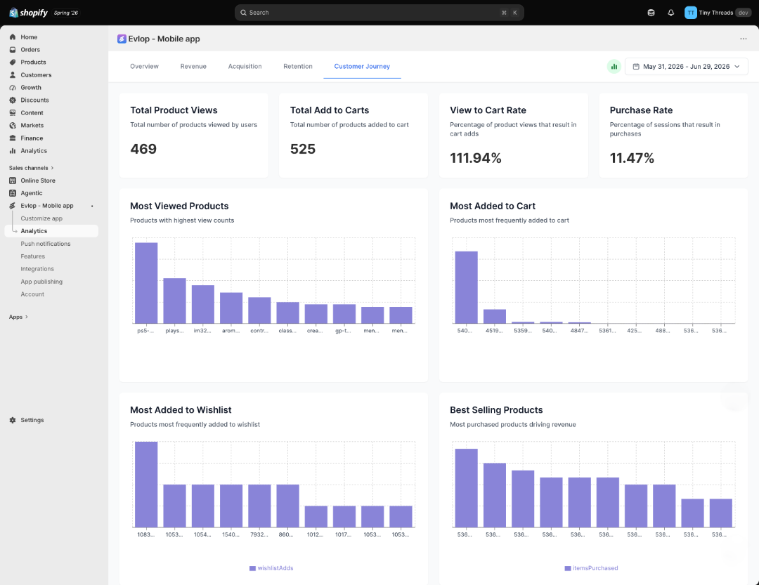
This is the most granular view in the dashboard, and the one closest to where revenue is actually won or lost.
Four metrics map your conversion funnel at the top: Total Product Views and Total Add to Carts sit alongside View to Cart Rate and overall Purchase Rate — from first impression to completed sale.
Most Viewed Products shows what is catching attention inside the app.
Most Added to Cart shows what is generating genuine purchase intent — customers who went further than a browse.
Most Added to Wishlist reveals what customers want but are not buying yet. That is often a pricing signal or a timing opportunity worth acting on. This tab is effectively your interest map — which products customers are drawn to, even before they've made a purchase decision.e
Best Selling Products shows what is actually closing. Cross-reference this with the wishlist chart and the gap between them tells you exactly where your conversion work should focus next.
What a real decision looks like
Here is a scenario that plays out regularly for merchants with mobile apps and no analytics. A product is pulling a steady stream of traffic from social ads, but mobile app sales remain completely flat.
How Analytics Diagnoses the Leak:
- ❌ The Instinctive Guess: "The product photos look dull, or the top-of-funnel ad targeting is off." The Result:Weeks wasted tweaking creatives and running endless, expensive layout tests that fail to move the needle.
- 🔍 The Data Reality: You open the Customer Journey tab. Most Viewed Products ranks this item in your top three—proving visibility isn't the issue. Most Added to Wishlist reveals it's highly coveted. However, Most Added to Cart is near zero.
- 💡 The Truth: This isn't a creative problem; it is a friction or pricing problem. The data just gave you the exact answer without a single blind A/B test.
🚀 The Actionable Fix: Instead of re-shooting product photos, you launch a targeted Automation Flow triggered specifically when a user views this exact item twice without adding it to their cart, serving them a highly focused, time-limited incentive.
This is what analytics is for — not reporting on what already happened, but pointing to the specific action worth taking next.
The picture only gets sharper
The most common hesitation merchants have about analytics is a version of "I don't have enough data yet to make it worthwhile." It is understandable, and it is backwards.
Analytics does not need scale to start being useful. It needs consistency. A store with 200 monthly app sessions and solid analytics has something far more valuable than a store with 20,000 sessions and no visibility: it has a baseline. It knows what its conversion rate is, what its bounce rate is, which products are getting saved to wishlists, and which days of the week its customers are active. That baseline is what every future decision is measured against.
When the store grows to 2,000 sessions, the changes in those numbers become meaningful. A jump in bounce rate tells you something changed in the app experience. A shift in the New vs Returning ratio tells you whether retention is holding as traffic scales. A change in Average Order Value signals that your customer mix is evolving. None of these conclusions are possible without the baseline — and the baseline only exists if you started measuring early.
The stores that look like they made smart decisions at scale almost always started measuring before they needed to. The data advantage is not something you build when you are big enough to need it. It is something you build so that getting bigger is something you can control.
The number that changes everything
There is a version of running a mobile app where every month is a surprise.
Sales are up — but you are not sure which product drove it. Installs are growing — but you do not know whether the people installing are buying or bouncing. A campaign felt successful — but the following week looks identical to the week before it ran.
Evlop's Analytics is the end of that version. It does not promise that the numbers will always look good. What it promises is that you will know exactly what they are, what moved them, and where the next lever to pull is hiding.
An app that can tell you the truth about what is working, what is not, and which customers are worth chasing — that is not a reporting tool. That is a growth strategy.
If you are ready to stop guessing, the dashboard is ready when you are. Get started at evlop.